

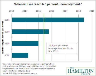
 In December the Federal Reserve (FED) announced yet another round of Quantitative Easing (QE) as Operation Twist was coming to an end. Through QE 4 the government will purchase $45 Billion in US Treasuries…every month…until unemployment comes down to 6.5%. So we were wondering how long this could take. The following chart lays out some scenarios. At the current pace jobs are being added to the economy, it should take until mid-2015.
Despite all of the money the FED has been pumping into the economy the Velocity of that money has continued to slow. Velocity means simply the rate the money is spent. Following is a simple example of money velocity:
- In a year I am paid $100 for going to work
- I turn around and spend $50 to get my clothing dry-cleaned
- Then my dry cleaner spends $30 of those dollars to buy food
The $100 in the economy was actually used to purchase $180 of goods and services over a year. Therefore, the velocity is 1.8 ($180/$100). Velocity of money is significant because we won’t likely see inflation in the economy until this picks up from the current record low levels over the past 50 years.
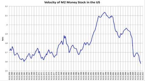
Source: Federal Reserve Bank of St. Louis
Note: M2 Money Supply is a measure of the total money supply. M2 includes everything in M1 and also savings and other time deposits.
Since money is not being spent with any speed, people must be saving. Savings have increased dramatically for individuals in the U.S. as interest rates on personal savings accounts and money markets have been plummenting. Many have moved from equities into bonds at record rates as bond rates have reached record lows. Overall, according to the chart below, people are saving more but fewer are investing in financial markets and investing in savings accounts instead. As you can see in the chart below the increase in percent of savings flowing into Money Markets rose from 29 to 61% over the past 4 years while the amount invested in financial markets has come down from 71 to 39% of total savings. If investors turn a corner and start to regain faith in the financial markets, money might start flowing back that way. This could create long-term tailwinds for stock and/or bond markets.

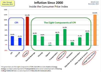
The chart below shows total Inflation over the past 12 years. For example, College tuition and fees have gone up 120.8% in the last 12 years, if a college charge $6,000 per year in 2000 to attend now it would charge $13,250! So if inflation is similar over the next 12 years how are we supposed to keep up with rising prices while earning less than .25% on our savings accounts meaning that same $6,000 invested at .25% over 12 years compounded annually will give us a meager $6,182?
Lastly, taxes are on everyone’s mind. On January 2nd a bill passed that will impact what everyone owes this year. I found the table below to be a helpful summary of the impact of this bill. For example, someone making around $85,000 per year will pay $1,147 more in taxes in 2013 than they paid in 2012.
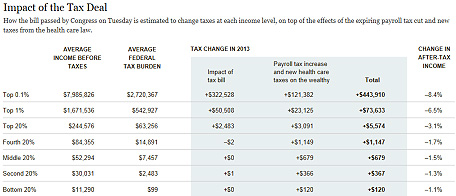
Source: The New York Times
We use this data and more to help shape the direction our investments and financial planning recommendations for clients take over the coming years.
The information has been obtained from sources considered to be reliable, but we do not guarantee that the foregoing material is accurate or complete. Any information is not a complete summary or statement of all available data necessary for making an investment decision and does not constitute a recommendation. Any opinions are those of Center for Financial Planning, Inc., and not necessarily those of RJFS or Raymond James.