This may be the most unique candidate for a leading indicator I’ve run across in a long time. A leading indicator is defined as a measurable economic factor that changes before the economy starts to follow a particular pattern or trend. You may have heard of an inverted yield curve predicting recessions or the number of building permits applied for predicting a housing boom or bust.
How about CNBC viewership predicting the next stock market boom or bust? Below is a chart showing Nielson Ratings for CNBC over the last eight years. The last time their ratings were this low was 2005 when markets had stablized after the tech bubble burst and we had enjoyed a couple of years of good returns. Sound familiar?

As you can see in the chart below of the S&P 500 total returns, 2005 was the start of some very nice returns which continued for the next few years. Could the low viewer ratings be a potential indicator that the returns we have experienced since 2009 are just the beginning? As returns accelerated toward the market peak in 2007 so did CNBC’s ratings into 2007.
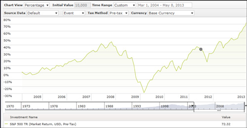
Data from Morningstar
As individual investors start to jump on the band wagon of a bull market run, they become more interested in what is happening to their money and thus turn on the news.
There are many reasons investors could be choosing not to watch the channel now:
- Investors have been lulled into a sense of security about market returns and aren’t concerned about current events
- Many are not actually invested in the markets; therefore, they do not care
- Investors are finding their information elsewhere
- They have grown tired of the sensationalizing the network does to try to get better ratings (which is actually my main reason for not watching)
Assuming investors aren’t watching anymore because of one of the first two reasons, then this could be a very good indicator of what is to come, potential positive returns as more individuals put money back to work in the markets.
It is too bad there isn’t much historical data to determine if this is, indeed, a good stock market indicator but it is definitely something from CNBC that is much more interesting to follow than their overly dramatic, TV personalities!
Angela Palacios, CFP® is the Portfolio Manager at Center for Financial Planning, Inc. Angela specializes in Investment and Macro economic research. She is a frequent contributor to Money Centered as well as investment updates at The Center.
Any opinions are those of Center for Financial Planning, Inc., and not necessarily those of RJFS or Raymond James. Any information is not a complete summary or statement of all available data necessary for making an investment decision and does not constitute a recommendation. Keep in mind that individuals cannot invest directly in any index, and index performance does not include transaction costs or other fees, which will affect actual investment performance. Individual investor’s results will vary. Past performance may not be indicative of future results.